PROJECT SYNOPSIS
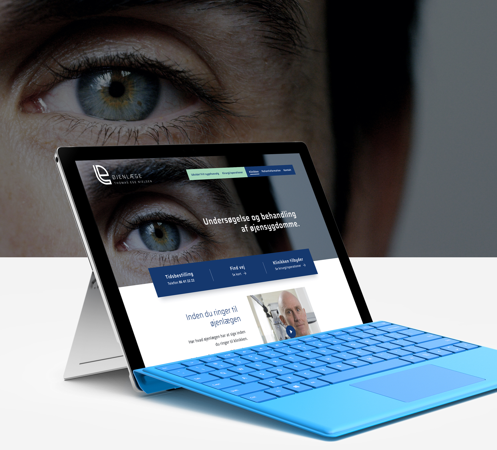
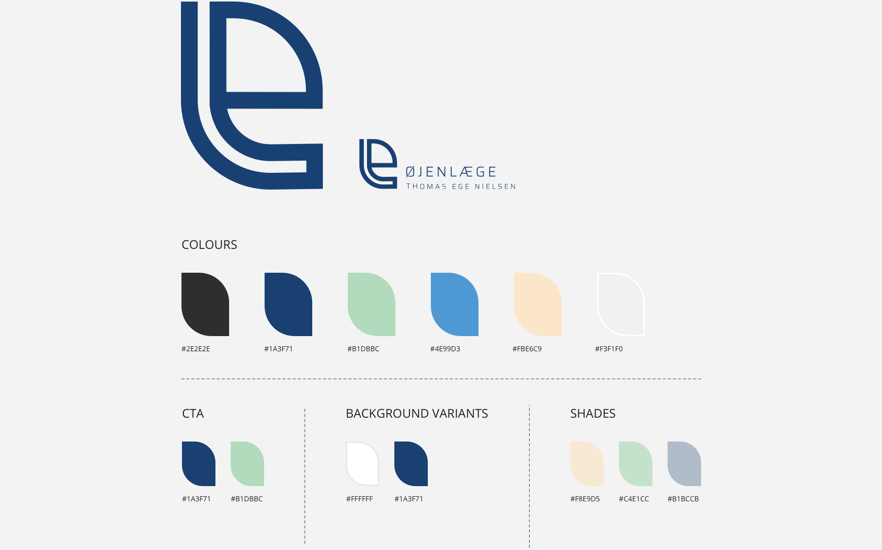
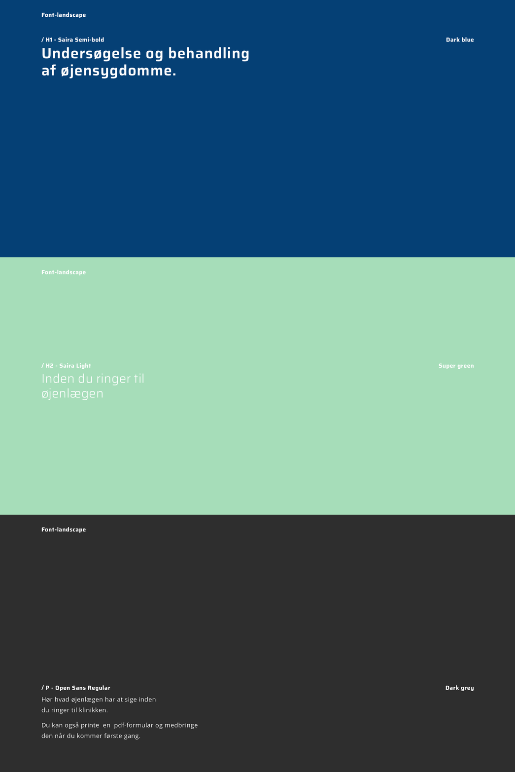
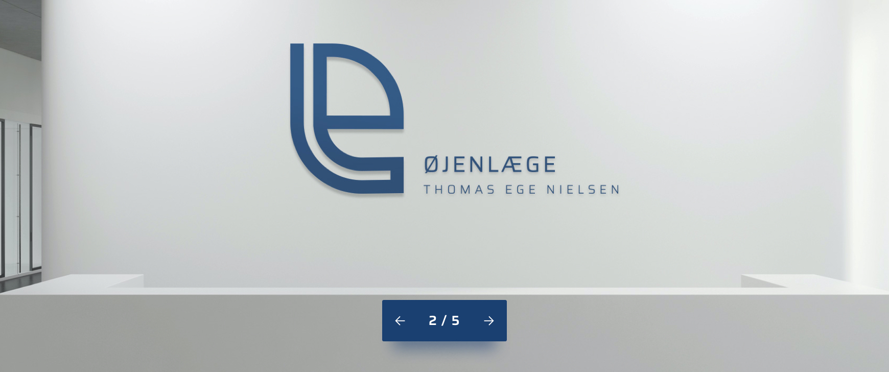
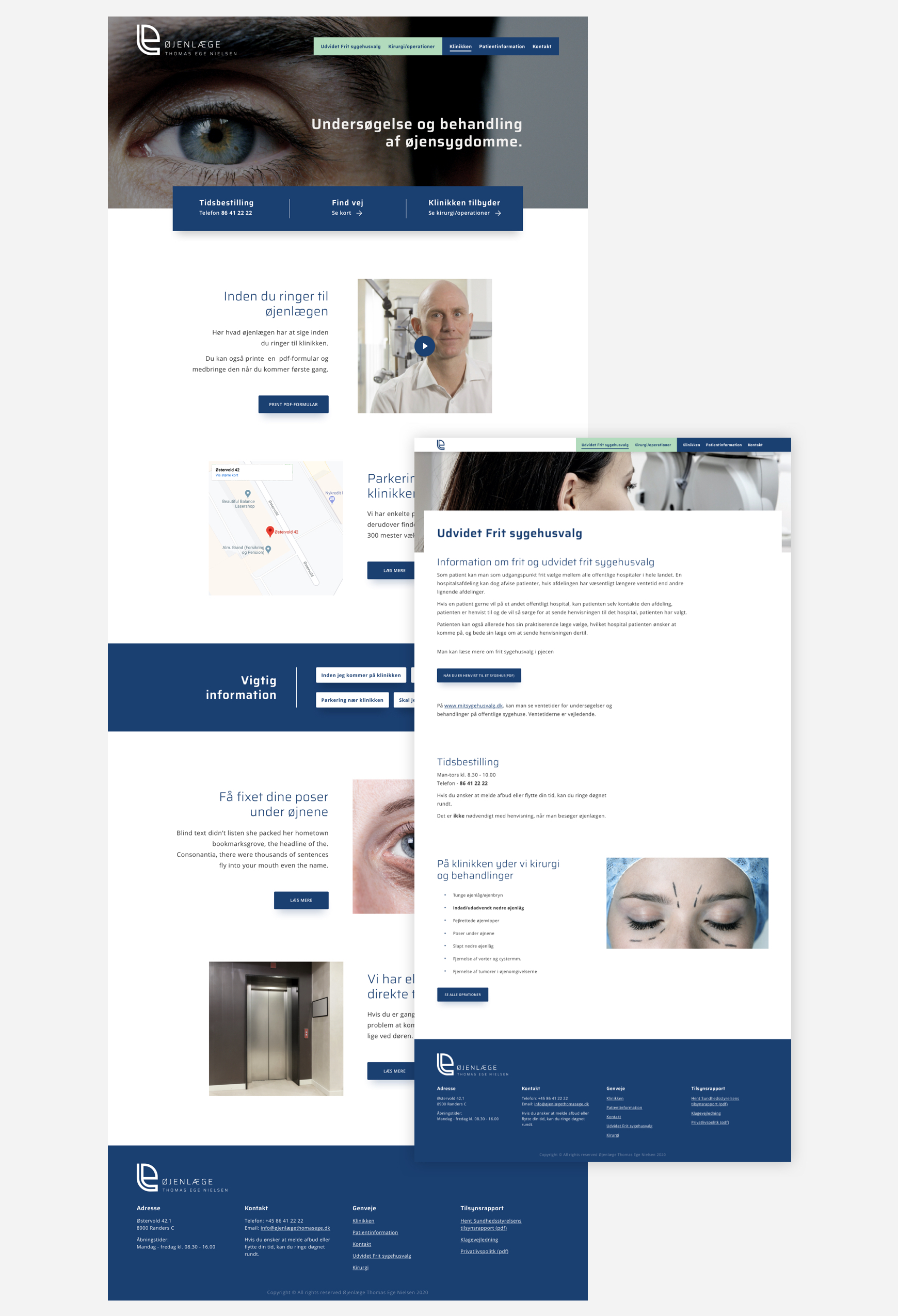
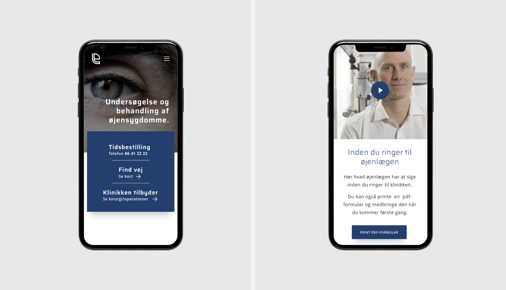
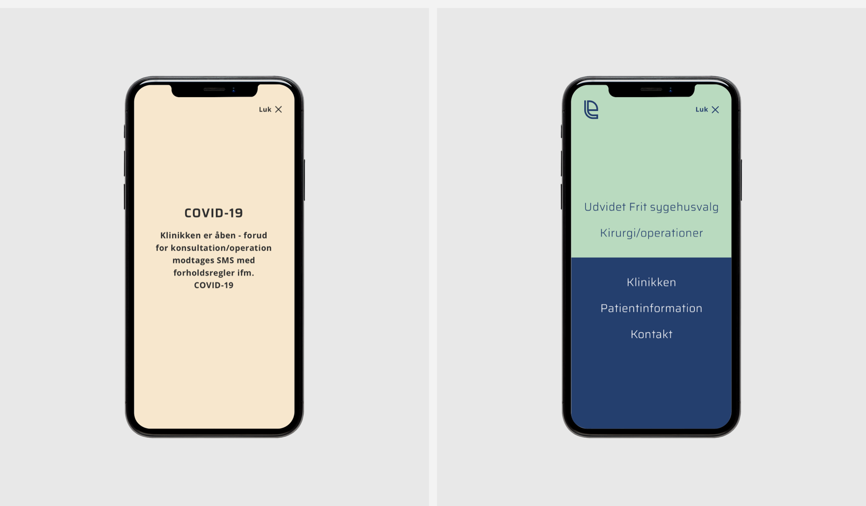
Thomas Ege Øjenlæge asked for a new identity combined with a website that offers him a better platform to visually stand out and brand his business.
AGENCY
Thomasnoergaard.dk
CLIENT
Thomas Ege Øjenlæge
Thomas Ege Øjenlæge asked for a new identity combined with a website that offers him a better platform to visually stand out and brand his business.
Thomasnoergaard.dk
Thomas Ege Øjenlæge
If you have a project or collaboration you would like to talk about, you are always welcome to a cup of coffee, looking forward to hear from you.
M: tn@thomasnoergaard.dk
T: 53 61 18 13